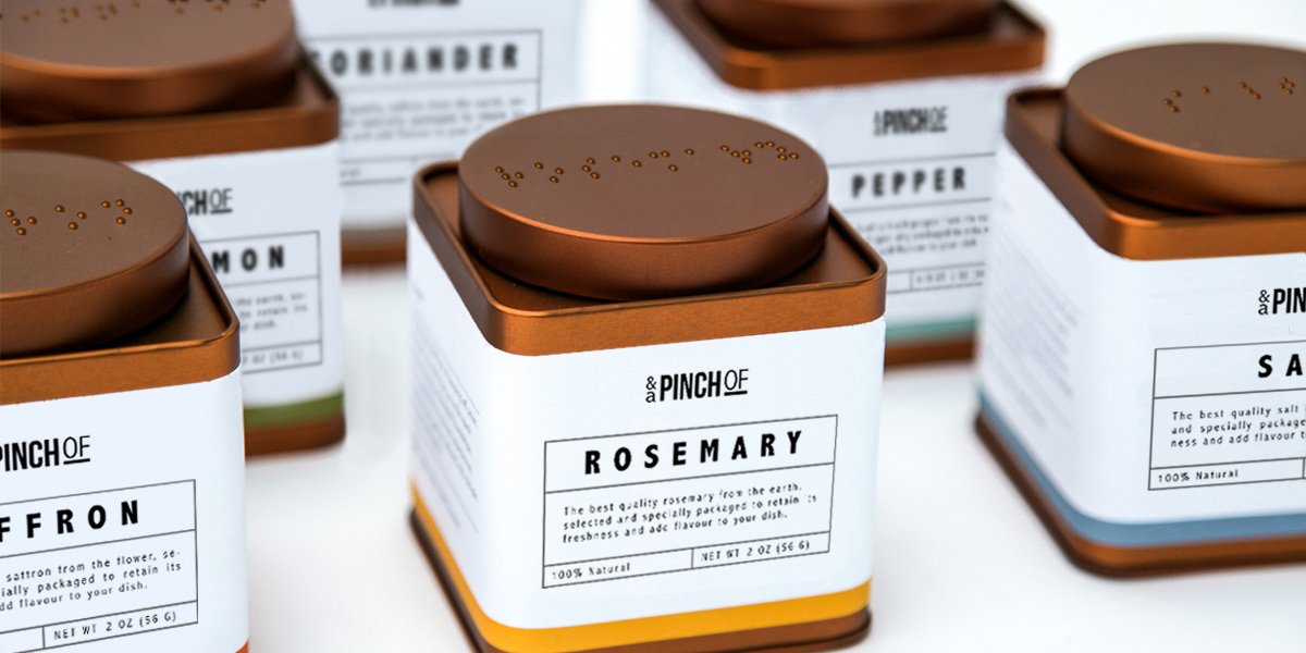
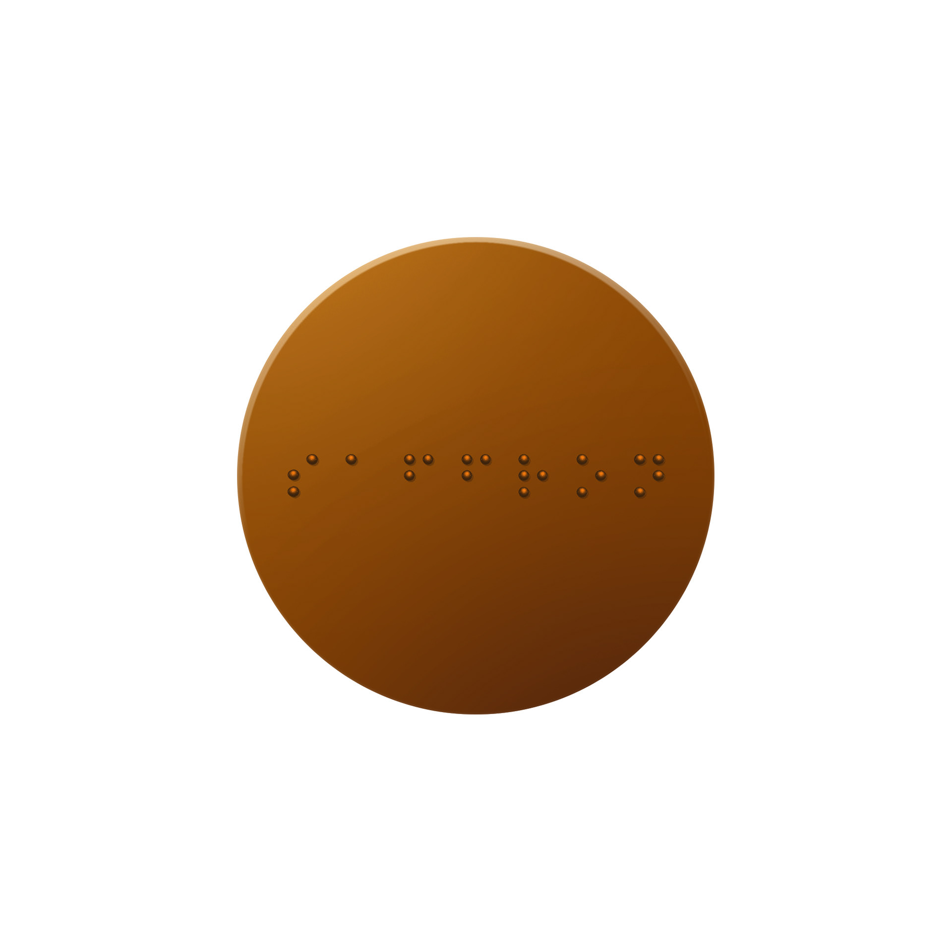
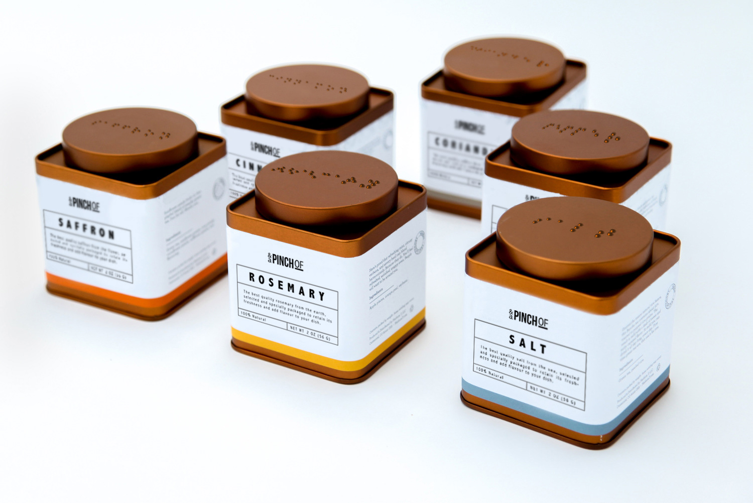
A friend asked me once "How would you design a spice rack for the blind?". After research, I decided to create some mock-ups to illustrate my idea. Instead of dealing with multiple racks, the containers would fit side by side in a drawer so that the blind are easily able to run their fingers across of the top of the lids on a 2-D flat plane. The tin containers can also be refilled and reused when a spice runs out.
I also wanted to make the containers visually appealing so that the market reach is not only for those who are blind. The logo is "And a Pinch Of." With the spice right under it, I wanted to play off of the phrase "and a pinch of –insert spice here–" in cookbooks. Along with the simple label, each spice has their own color strip at the bottom to add variety to the design.